New Acute Centre Viborg, Competition
New Acute Centre Viborg, Competition
Project:
Status:
Architect:
New Acute Centre Viborg
Competition
MIKKELSEN ARKITEKTER AS
Solution concept
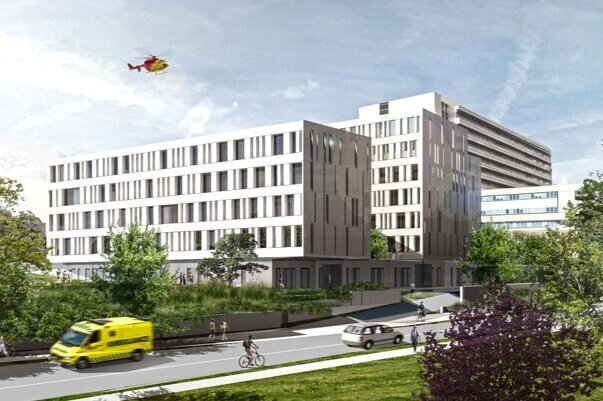
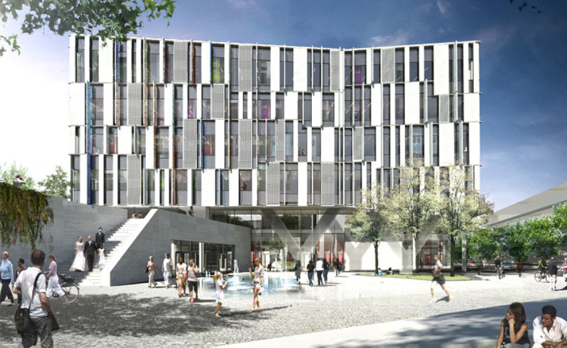
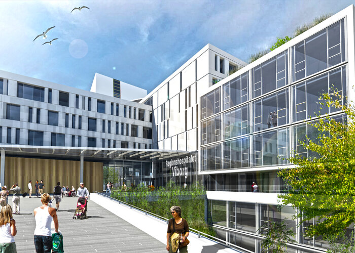
The new emergency centre is planned and designed as a series of east-west staggered lamellae. The slats are stepped down towards the south, following the slope of the terrain. The site and terrain are relatively steeply sloping from north to south with very good views over the landscape and in particular the Søndersø lake to the east. The surrounding buildings to the west, in addition to the existing hospital, are designed as block buildings, while the buildings facing Søndersø consist of east-west oriented slats, which allow visual contact between the site and Søndersø. The site is surrounded by Gl. Århusvej to the east and the railway line to the west. We propose a concept that builds on the qualities of the area, the natural slope of the site, the view to Søndersø, and the built context of the area. The new emergency centre is planned and designed as a series of lamellas placed in an east-west direction and staggered. The slats are stepped down towards the south, following the slope of the terrain. The lamella structure naturally builds on the existing urban planning context introduced by the buildings to the east of the hospital: single buildings in a lamella structure.
The structure contributes to differentiating and breaking down the hospital's large building volume, opening it up, adapting to the nearby urban context in terms of scale and enabling visual contact from the emergency centre to Søndersø.
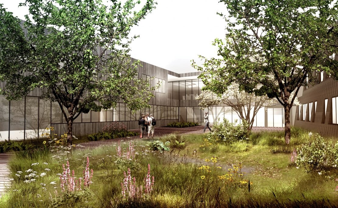
This makes it possible to provide green park-like "soft" outdoor areas on the east side of the emergency centre, where the lamella structure allows subdivision into more or less intimate outdoor zones, while the "hard" outdoor areas to the west form the arrival area with associated traffic areas.
The lamella structure can naturally expand and accommodate new building lamellae for future extensions on the site to the south which can be tied onto the structure, designed and stepped naturally in relation to the slope and site boundaries. Given that it should be possible to build at heights of up to 14 storeys, we have considered that the spacing of the lamellae is appropriate, although it could have been more compact at this stage.
The hospital
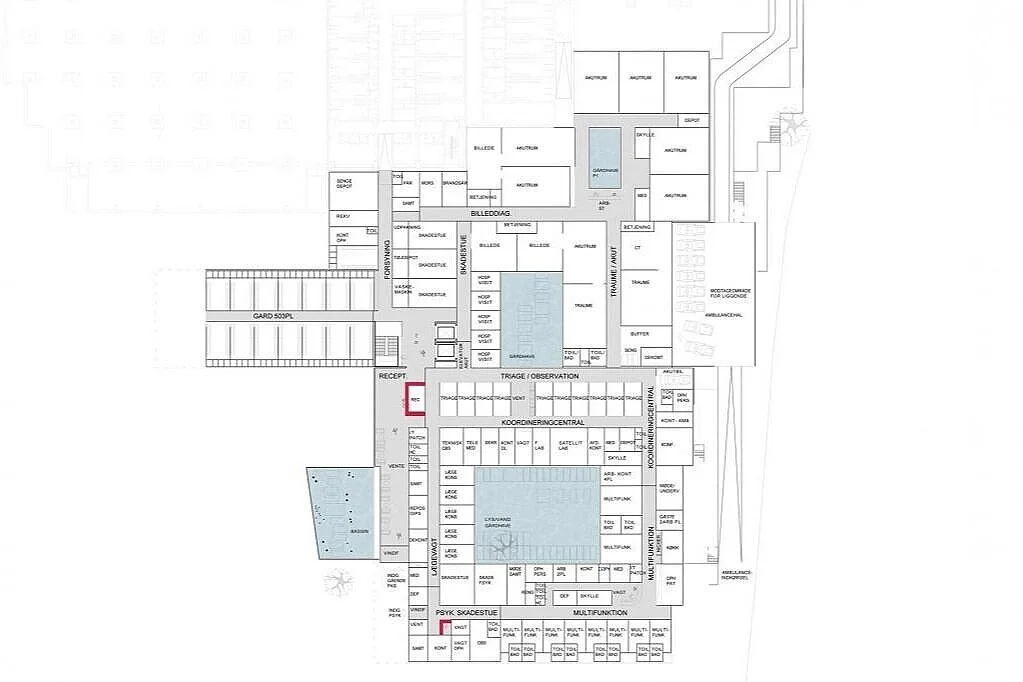
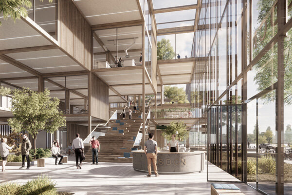
For the hospital, it is important to have solutions that are space-efficient and future-proof, where generality and flexibility make it easy to redeploy the organisation, technology and structure to give the hospital the elasticity needed for possible adaptation. A plan structure with a continuous traffic axis and transverse slats is obvious for compact plan solutions, for flexibility and for being able to accommodate changes over time, including the possibility of differentiated function allocation. In addition, this structure provides opportunities for good daylight conditions, good visual contact between inside and outside, the possibility of placing different space zones with short corridor solutions within the individual sections. The structure enables the use of a narrower building volume with a space-efficient one-corridor solution, where the building width accommodates wishes and requirements for flexibility, daylight and a good indoor climate.
In view of the planned expansion of space and the increased number of patients, we believe it is right to consider the hospital as a miniature city plan, with streets and squares that are rich in experiences, linking everything together into a whole with good contact and views of nature. From this point of view, we want to provide a large overview with a self-explanatory coherent logistics.
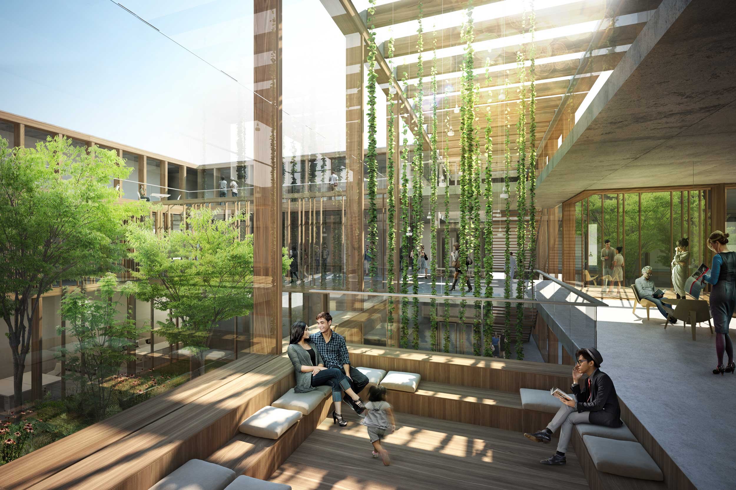
We want to tie in with and build on the current transport hub axis. In the future, it will also be the "intermediary" in the structure. We also propose to add extra qualities to the main axis by adding some new "break spaces" that allow for casual meetings and stays, while bringing the landscape close to the main axis. The break spaces open up over several floors. Break spaces help to explain the traffic hierarchy and create identity and life in the main axis. naturally in relation to the slope of the terrain and the boundaries of the site. Given that it should be possible to build at heights of up to 14 storeys, we have judged that the spacing between the slats is right, although it could have been more compact at this stage.


